Final Fantasy VII Rebirth is poised to be one of the biggest releases of 2024 and for a good reason. The game looks amazing, and the demo’s story sequence seems much more faithful than the first part. Moreover, Cloud is more mobile than he’s ever been.
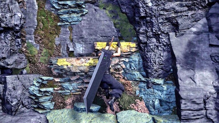
After getting our hands on the game’s final preview, we learned Cloud can now vault over ledges hop fences and scale up a wall in a sequence that plays like a tired linear action game from the mid-2010s.
By now gamers are very accustomed to these kinds of scripted moments where the game pushes players in a direction up a wall along a predetermined set of climbable points, yet it seems Rebirth’s designers do not think highly of the player’s intelligence.

Of course, I am referring to the eye-rolling design choice of sloppily applied yellow paint on interaction points so that the drooling, knuckle-dragging gamers can figure out where to go. This odd design choice was also recently found in the Resident Evil 4 remake.
This is a regrettable direction to guide players where to go because it’s distracting and it makes no sense in the reality of the game. What is especially frustrating about this is that there have been graceful solutions to this dilemma for decades.
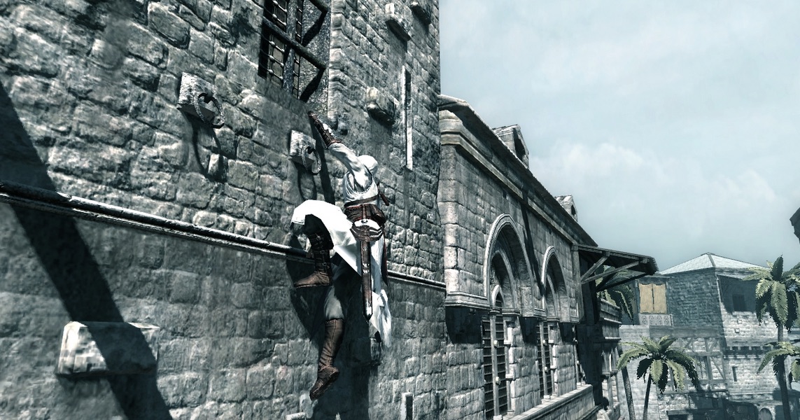
Assassin’s Creed from 2007 figured out how to have surfaces that players can climb without intrusive paint. The rules were that Altair could grip and scale any protrusion or brick that was sticking out by about two inches.
This has been a proven and effective system that still is used by the Assassin’s Creed franchise for over 15 years and seeing Rebirth take a clumsy route is utterly perplexing.

In the Assassin’s Creed games, players are given a lot of freedom and flexibility to explore. Given how Square Enix’s goal with Rebirth is to give players more freedom than in the first part, it’s disappointing that they’re relying on such an amateurish design choice to guide players on what is a climbable surface.
The issue in Rebirth is an art direction choice. Some may argue that having crude yellow paint is helpful so that gamers don’t get stuck. To this, I say, “Too bad” and that Square Enix could do a lot better by learning from other examples from the past.

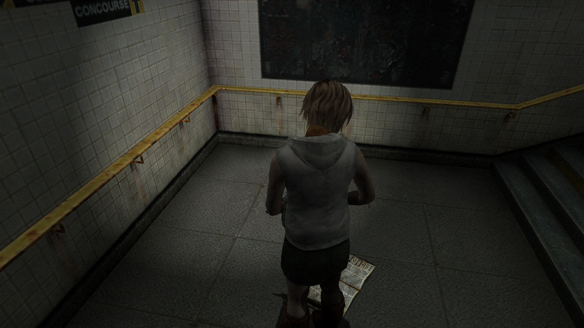
Silent Hill 3 came out in 2003 and it came up with a brilliant idea to keep players immersed in its setting without wasting their time trying to figure out what objects were interactable.
The environments in Silent Hill 3 were highly detailed and full of stuff to investigate and many doors were decorative with no way to open. The designers had to find a way to guide players on what was important without compromising the art.
Team Silent’s solution was simple and perfect: Heather’s head would track anything that was interactable. Any door that could be opened, item, or any note would catch her attention and players would instinctively realize that this was important.
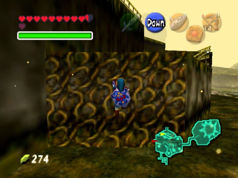
This genius design choice would separate nonessential background objects from the crucial ones, ensuring an uncompromised atmosphere. Even further back, The Legend of Zelda: Ocarina of Time from 1998 had the simplest solution of all.
A basic vine texture is sometimes all you need. With the advancements of Unreal Engine 4 on PlayStation 5, modern vine/moss surfaces could look very convincing using all kinds of sophisticated bump mapping and shaders.

There is no excuse for Final Fantasy VII Rebirth to rely on such a cheap and sloppy method to convey the critical path to gamers. As far back as some of the earliest 3D games ever made, there have been thoughtful solutions to crafting a climbable surface that communicates where to go.
Hopefully, the retail release of Rebirth will be stuffed full of features and awesome drama that this nitpick can be overlooked. As the launch day inches closer, only time will tell.