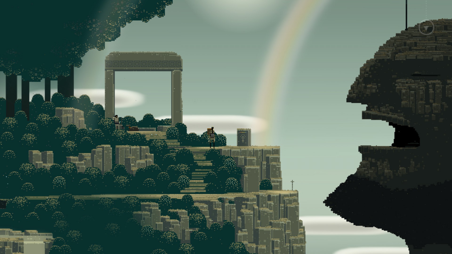
In 2011, Capybara Games and Superbrothers released Superbrothers: Sword & Sworcery for iPad. Since then it has hopped ship onto PC and consoles, being an indie darling with high praise from critics. Arguments still happen from gamers over how valid the pros and cons were. Read on and see Niche Gamer settle it.
Superbrothers: Sword & Sworcery
Publisher: Capybara Games, Superbrothers
Developer: Capybara Games
Platform: Mobile (Android/IOS), Windows PC, Mac, Linux, Nintendo Switch (Reviewed)
Release Date: November 30th (Switch)
Players: 1
Price: $3.99 (Mobile) $7.99 (Steam), $9.99 (Switch) (Review Copy Received)
Right off the bat we see a guy in a suit telling you faux tongue-in-cheek they ditched social media features in the Switch edition, since social media ruined society. This is ironic considering the original Twitter integration drove people barmy with a barrage of your friend’s progress and spoilers.
He then says that the first “session” should only take 15 to 30 minutes to complete. It is hardly a way to start your fantasy adventure, and the game’s presentation continued to rub me the wrong way throughout.
You eventually piece together that the main character is looking for the Megatome – a book full of powerful “sworcery”. After completing each session (a chunk of the story), we get a brief presentation from the man in a suit to explain what just happened, and what’s coming up with some attempts at humor.
Overall you seem to be gathering pieces of some triforce-esque object that will banish a terrible immortal monster. Its only real crime seems to be killing some people who were looking for the same relics you are.
The game’s entire presentation feels very pretentious. For example, you initially get brief one word descriptions of how to play. While it seems hands off, it is actually the very opposite; like an artist whispering over your shoulder how you should enjoy his work so you do not miss anything. “Touch.” “Listen.”
I even got similar messages well into the game. Like “trespass” when I clearly entered somewhere I would have to be blind and deaf to not know was foreboding. Or “Believe” to make me walk across water.
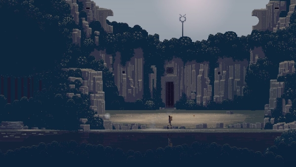
I would rather have an obtrusive text box than endure a smug tutorial attempting to be meaningful. As for trying to tell the player info they already know from what’s being shown? I cannot imagine anything more insulting.
When the game is not being very obvious, it becomes obstinate. Such as a puzzle linked to the real life phases of the moon- which will be a different date for you depending where you live, and not reflected in the game. I still have not worked what dates the game considers a full moon and new moon (I received a code for the US e-shop, and I am based in the UK).
While there is supposed to be a side-quest to let you bypass this requirement, I was stuck on the new moon phase for several days- since the side-quest cannot be started during a full moon or new moon. On other platforms you can change the system’s time and date to get the date you need- only to be burdened with a “Time Paradox” and prevented from getting 100% completion.
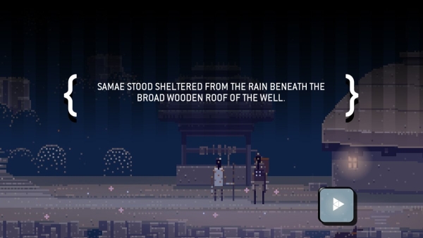
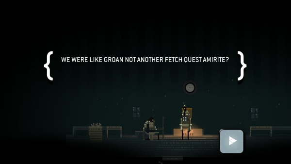
The awful style choices and decisions will also occur with text from time to time as you study the environment and speak to people. “He seemed pretty cool, but wasn’t jazzed about it”, “The woodsman had the key for the stone door. It was a cool looking key.”
It desperately tries to be quirky, modern and hip despite the sombre fantasy setting. Instead it feels bizarre, dated and desperate. It is all very “how do you do fellow kids”- with poor attempts at being relatable and laid back. Not every text box was like this however, which made it stand out more. It certainly came across as though two different people wrote it.
The attitude permeates every atom of the game. After completing a session, it has the audacity to boot you back to the title screen. Apart from the game not being very taxing- you don’t have multiple save files. There is no reason to be sent back to the title screen other than to see your progress bar and how much you’ve waded into this mess.
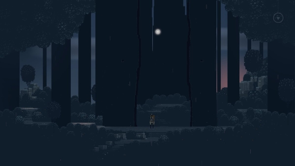
Instead of being intriguing, it feels patronizing. You see the title appear again when starting the next session (again, from the title screen). The suited man asks you if you are ready to carry on and strikes up another one-sided conversation. I even got a title screen that presumably hid a loading screen between the real and sleeping world. There are worse examples to boot.
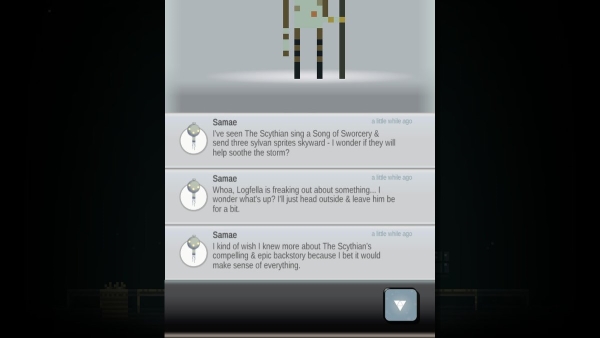
Another time, after you can read minds, I read the mind of the suited man. Reading through his thoughts (arranged like tweets), he recommended “curious and relaxed individuals are more likely to enjoy the game,” and that it should be played in a warm and secure place. It feels like the creators were digitally masturbating in front of me, and I was not impressed by what I saw.
I loathe focusing on presentation before gameplay, but the presentation is so dull and that it forces itself to be something more grand is infuriating. I would not care if the gameplay was effective- if it was fun I may not even care about the presentation issues. The sad truth is, there are more moments focusing on presentation than the lack-luster gameplay.
Your objective is usually to go to-and-fro (at an achingly slow pace may I add), and either fight creatures or find spirits. When those are complete, you usually then have to go elsewhere for more fights or puzzles. You can also tap on objects for snippets of shallow lore that risks being “totally awesome.”
There is zero exploration, and side-paths are usually utilized later on as you progress. The few times there were branching paths, it was usually in an enclosed space, and no worse than four or so rooms connected in a square shape. At times paths between areas even loop around in impossible geometry.
The long walks can be somewhat alleviated by double clicking on where you want to go (such as an exit or object). In one instance I accidentally warped out of a dream (entirely my fault), and had a very long walk back. I pressed on for the sake of the review.
Combat is almost akin to a very basic Punch Out. You can attack and block, but enemies cannot just be wailed on as they are either shielded, or standing a few steps away. I never cared about standing still during a fight in an RPG, but here it just looks weird.
You can attack just before enemies hit you, since you cannot hit them otherwise and their attack is so strong blocking makes you stagger and unable to attack straight after. If that is not the solution, then it is attacking just after you have blocked them. Combat does not evolve beyond this except for the game’s bosses.
Along with throwing in ideas like healing when you defend for a very long time, and the block button becoming a dodge at specific moments, the boss battles do the idea of a rhythm based survival against it in the worst way possible.
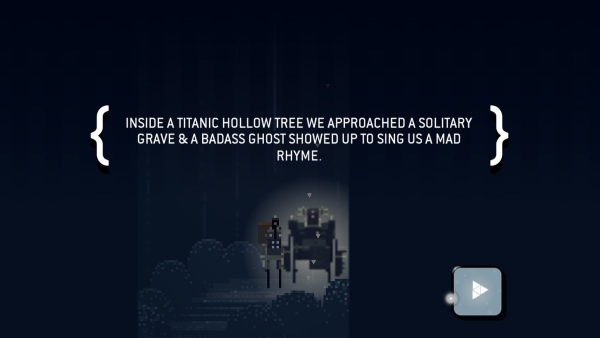
Achingly slow, having time to heal by blocking between phases (a process of nearly 30 seconds), and gradually growing faster. Apart from the perspective making parries harder to time, the down-right sluggish boss is made worse by the odd instant-kill attack. Combined with how you start over from the first phase if you lose, it feels unfair and too simple at the same time.
Finding sprites are along the lines of those surreal “find X object” puzzles, albeit very basic. You tap, rub, or hold to interact with the environment. They typically involve luring an object to a specific point, tapping on objects in the right order (usually smallest to biggest, least to most, etc), rubbing something, and combinations of the above.
It can be a little charming to paint a rainbow across the sky, find birds to tap on, or work out the order to tap trees from thickest to thinnest, but it is still very easy. Aside from the odd moment that dramatically changed the environment, you don’t get much fulfillment from solving puzzles.
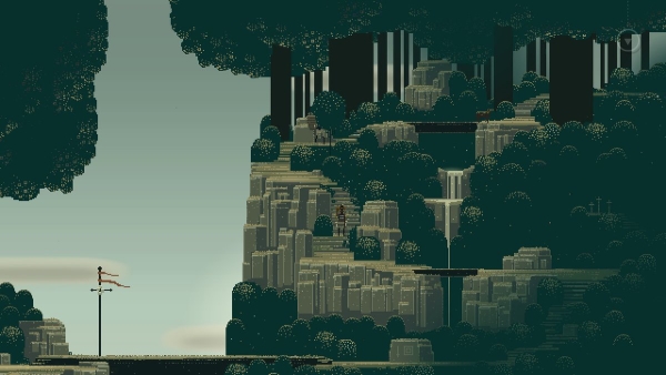
I did manage to find one optional quest- and the reward was not worth it. Seemingly some kind of diorama as you watch characters fade in and out. The puzzle was not even hard- I got past the problem then had yet another very long walk in an area the developers were clearly very proud of.
I struggle to think of anyone who would be challenged by this game- and still have the attention span to pay attention during the long amounts of time nothing happens.
The Switch version offers three different control modes. Controller and Touch allow you to move your character normally by analog stick- though you need to double tap A to interact with objects- or use the touch screen (if the console is not docked). Point & Click mode lasted all of 5 seconds as I had to constantly hold down a button while pointing at the screen to move.
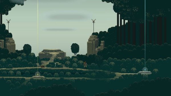
The graphics are plagued by the “fake pixel art” trend, if not the originator of it. Each “pixel” is a giant block, with a color pallet not present on any retro console. The characters are ugly stringy armed blocks that move robotically. If not for interacting with them, I could not tell who was man or woman. The game also utilizes some assets that are not pixilated to further torment the eyes.
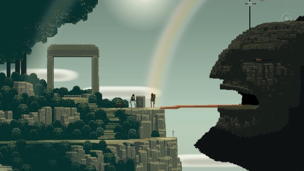
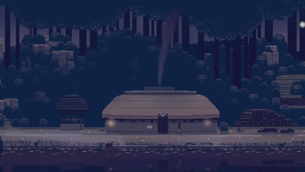
The backgrounds are a much nicer affair. Nothing exceptional, and the characters stick out like a sore thumb, but they certainly had more thought put into them. Colors are a little washed out, but this may be to make sure brighter colored elements “pop” more. Even so, the game is hideous when zoomed in, and I made sure to zoom the camera back as much as possible.
The music is certainly nice, but I cannot remember a single tune from it. Both music and sound suffer from doing their job well enough not to earn scorn, but not doing anything exceptional. When weighed down by being part of this game, I think even exceptional work would have fallen on dulled senses.
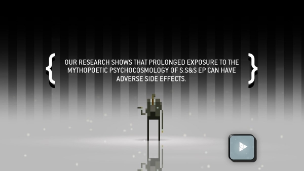
Superbrothers: Sword & Sworcery EP is a boring game dressed as an intelligent one. I should have known from the title alone; putting the designer’s name front and center, the deliberate misspelling of sorcery to generate mystique. The only “highbrow” thing here is how high mine shot up in surprise reading the praise this game got from some critics.
None of the gameplay is smart or challenging. The environments, while they can be pretty, are nothing special. The story is so non-existent and uninspired, calling it paper-thin is not enough. Even other mobile and browser-based games at the time of this game’s release did more with less, and did not try to act like they were thought-provoking to hide their flaws while doing it.
If you cannot do better than other games designed purely to kill time with minimal of depth and challenge and if you cannot do better than books, listening to music, or even just daydreaming- how can you call yourself a game? Avoid this one even if you can get it for free.
Superbrothers: Sword & Sworcery EP was reviewed on Nintendo Switch using a review copy provided by Capybara Games. You can find additional information about Niche Gamer’s reviews/ethics policy here.