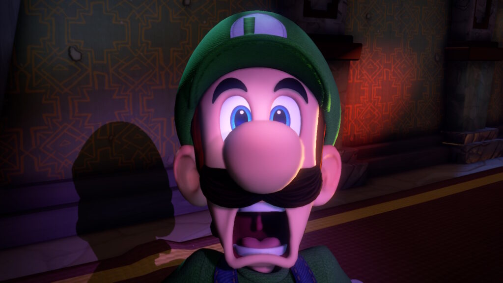
When the original Luigi’s Mansion came out on Gamecube back in 2001, it stood out from any other game in the Super Mario franchise. There was no platforming of any kind, and players found themselves exploring an enormous house, busting some ghosts and solving puzzles.
It was unusual launch title since it flew in the face of the typical light-hearted appeal Nintendo was known for. For a cartoony series, suddenly the atmosphere took on a grittier tone, and Luigi would spend most of the game in a constant state of high-strung anxiety. Naturally, this became a cult favorite, and got a sequel on the 3DS more than a decade later.
Luigi’s Mansion: Dark Moon would ultimately prove to be a disappointing sequel by losing much of the appeal of the original. Gameplay became mission based, and the art style became much more gaudy. Does Luigi’s Mansion 3 succeed where the first sequel failed to impress? Or is Mario’s brother facing a foreclosure?
Luigi’s Mansion 3
Developer: Next Level Games
Publisher: Nintendo
Platforms: Nintendo Switch
Release Date: October 31, 2019
Players: 1-8
Price: $59.99
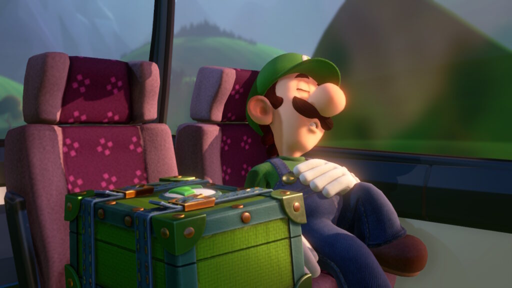
Luigi’s Mansion 3 makes a strong first impression. The visuals are very impressive, and are very close to resembling a CGI animated movie. Characters are highly expressive, and playfully bounce as they move with enough weight to ground them.
Various materials throughout are highly detailed, and have a slightly exaggerated look to them to add extra tangibility. Metallic objects shimmer and glisten realistically. Grass is dense and has real-time physics applied, so that individual blades of grass sway as gusts push and pull them.
Luigi’s Mansion 3 is a kid-friendly horror game after all, so light and shadow play a big role in establishing the atmosphere. Whether it is the flashlight casting shadows of objects or colorful ambient glows, the aesthetics have a very slick and glossy feel with how packed the image is with light sources and color.
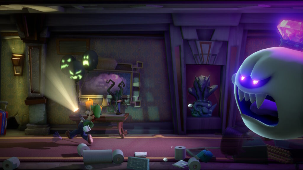
The intense and garish spread of color and light is impressive in its own right, but for something like Luigi’s Mansion 3, it comes off as misguided. The original Luigi’s Mansion was much more subdued and restrained with its visuals, often making the setting feel dusty and dirty. It was unlike anything seen in a Mario game before.
Luigi’s Mansion 3 comes off as much more safer and as a result, much more bland compared to its GameCube grandfather. That is not to say that Luigi needed to be put in Silent Hill- but for a horror game that is meant for kids, it would be appreciated if there was more effort put into making the ambiance grittier and less generic.
Another good example of a horror game aimed for kids that is also on the Nintendo Switch that flawlessly nails a horror vibe with its art direction is Little Nightmares. Emphasizing on grit, filth and murky air made the setting very memorable. Meanwhile Luigi’s Mansion 3 looks like another assembly-line produced Dreamworks movie.
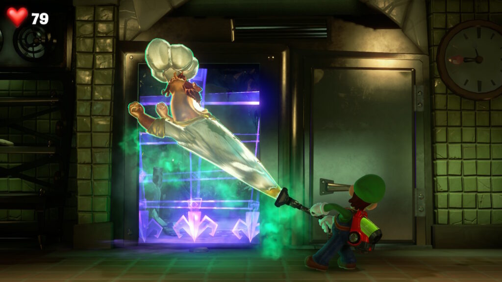
The safe art direction also extends to the designs of most of the ghosts, who look more like side characters from a Casper the Friendly Ghost bootleg than anything from Mario’s universe. Facial animations and expressions are competently made, but they lack the agony or pain seen in Luigi’s Mansion on Gamecube.
The disappointment in artistic direction does not end with visuals; the audio also fails to live up to the standard that was set in 2001. The original had various musical cues that would play out depending on what Luigi would be doing, which would give the illusion of a layered soundtrack. Sadly, this attention to detail is no present in this third game.
On its own merits, the artistic choices in Luigi’s Mansion 3 are legitimately impressive. Compared to where the first game was pushing new effects rarely seen in a console; reflections, real-time shadows, and cloth physics… It is disappointing to see how little the franchise has come to pushing technology in new ways.
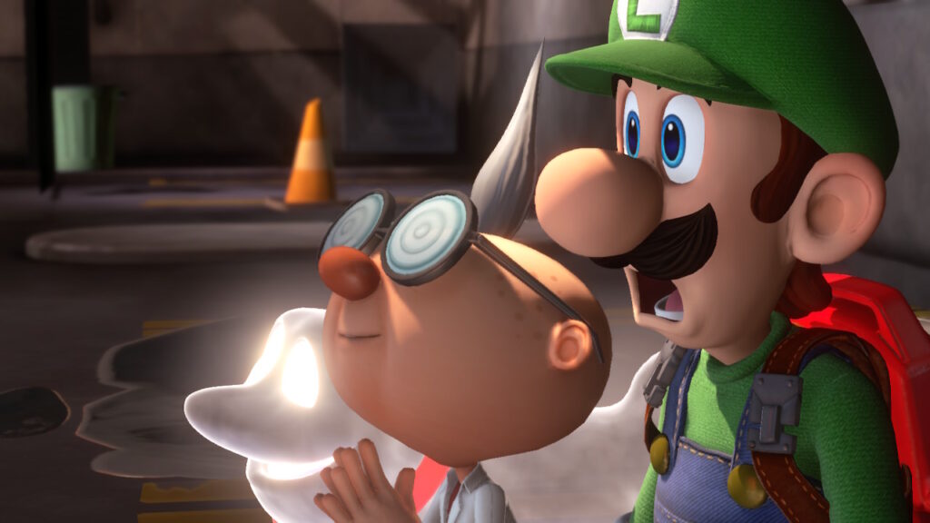
Even if you are blown away by the visuals in Luigi’s Mansion 3, the gameplay won’t impress anybody. Like its predecessors, this is a quasi-survival-horror with some collect-a-thon elements thrown in. Expect to have to solve some environmental puzzles using Luigi’s tools and abilities, finding keys, and sometimes getting into scraps with some poltergeists.
There is potential in much of the design, but so much of it gets undercut by baffling choices. The balance is woefully easy to the point all tension is lost. If Luigi takes damage, the game is much to quick to react to this, and will almost immediately spew out a health pick-up as you hoover the various bits and bobs lying around.
All the money Luigi earns is also almost worthless, since the only things he can buy only further rob the game of any challenge it may have. Perhaps if the game had a bit more bite to it, then maybe all the thousands of dollars that Luigi sucks for would have some utility. The funds could be used to buy resources that he could actually use.
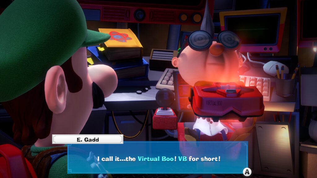
Going out of the way to collect the hidden gems or to bust the optional boos is also not worth the time, because the reward is utterly insulting. The original Luigi’s Mansion was often criticized for being too short, and while it wasn’t packed with worthless collectibles, it at least respected your time.
Puzzle design is lacking, often crafted in a way to make you feel smart instead of requiring you to be smart. While this is par for the course for most puzzle-centric adventure games, it is becoming a tired cliché to walk into a room, already have the puzzle solved in your head, and to have to tediously go through the motions to solve it.
The structure is very rigid and linear. It would have been interesting if the hotel was designed in a way to allow players to more freely explore it at their own pace like in an old-school Resident Evil, where many puzzles could be done in varying sequences and floors connecting in more natural ways.
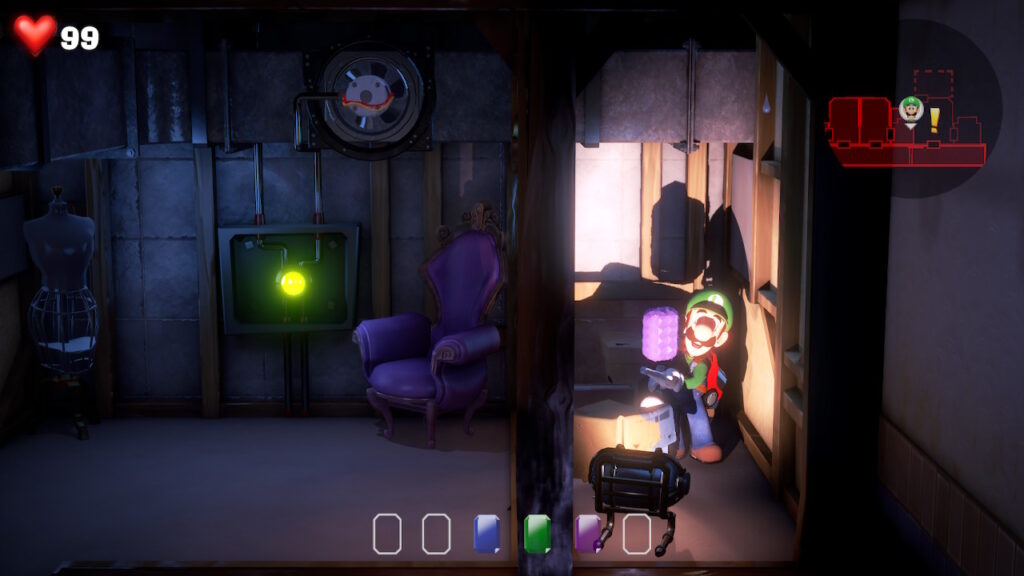
Most of the experience is sucking everything you see for triggers or squirting out Gooigi to have him ooze his way through some area Luigi can pass. Often both characters will have to be used in tandem to negotiate an obstacle.
Their tools like the plunger or the various torch settings will be cycled through every room, and after a while it just becomes work. When you have exhausted all that there is in one room, an overwhelming wave of dread washes over you as Luigi steps into the next room and the dull cycle begins anew.
Luigi’s Mansion 3 is much longer than its predecessors, and maybe the series was better off being short. The hotel does have a huge breadth of things to see and do, but it does overstay its welcome at around the six hour mark. By that point not a whole lot is accomplished, and Luigi is still bumbling around sucking or blowing on anything or everything in the Hotel.
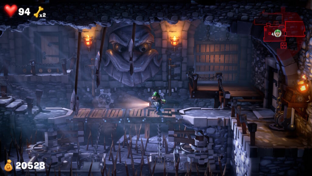
Other than the effort put into Luigi’s Mansion 3, the next most enjoyable aspect is its controls. Luigi may not be able to do much without his Poltergust or wad of Gooigi, but with great limitation comes with great creativity.
Controls are almost like a 3D twin-stick shooter, but with some added functions where it is very easy to get Luigi to quickly switch from strafing to standard 3D movement. The motion controls are brilliantly used as a means to aim up or down, while right stick rotates. Controls feel very accurate and tight, the only hard part is staying awake from the boring game design.
Another major feature in Luigi’s Mansion 3 is the multiplayer. Players explore randomly generated floors, and have to work together to progress. As expected, this is not a mode that many people play and no sessions were able get initiated with an adequate party for this review.
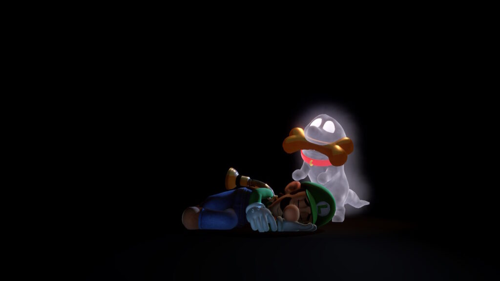
Replay value is low, since all rewards are either pointless achievements or worthless “upgrades” to Luigi’s flashlight. The scenario is lengthy, but there are no option to explore at your own pace, so every playthrough will be almost the same.
Luigi’s Mansion 3 is a mediocre puzzle-adventure game that is elevated by its polish, impressive visuals, and slick presentation that everyone has come to expect from a Nintendo game. Without its flourish, it is just a hallow and boring experience that might put you to sleep.
Kids will love this game for its bouncy imagery and easy to understand puzzle design. Anyone who grew up playing Luigi’s Mansion on GameCube will find this as a nostalgic distraction, but not a worthy successor. It is just more of the same but with less heart.
Luigi’s Mansion 3 was reviewed on Nintendo Switch using a personal copy. You can find additional information about Niche Gamer’s review/ethics policy here.