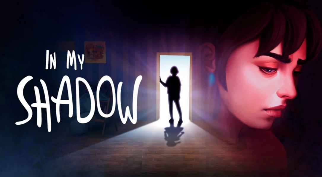
Using silhouettes and shadows for 2D action or puzzle-platformers used to be a novel and creative approach to making a game. There was Donkey Kong Country Returns with its stylish silhouette stages, Limbo was a game bathed in darkness and Lost in Shadow was a Wii cult classic that stands tall as one of the best examples of what artists could do with the concept. A new indie game attempts to recapture this, so we gave it a shot with our In My Shadow review.
Since then, there have been several indie games that attempted to use this style to convey a somber ambiance. It has the added benefit of cutting costs for detailed characters without compromising visuals. There will likely be no shortage of 2D games that rely on shadows and In My Shadow comes along with its own gimmick; what if players could move objects to alter shadows?”.
How does Playbae explore this premise and wrap it up with a seemingly personal story about a regretful woman? A sloppy presentation, rough controls and narrative with no substance, is exactly how In My Shadow bungles its concept. Read more in our In My Shadow review!
In My Shadow
Developer: Playbae
Publisher: OverGamez
Platforms: Windows PC, Nintendo Switch, Xbox One (reviewed)
Release Date: December 21, 2021
Players: 1
Price: $11.99 USD
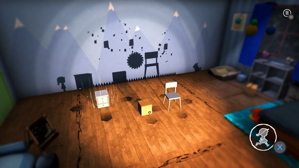
In My Shadow seems like it is a prototype to a good idea. The basic gameplay loop is that the player has to collect three items and reach the other side of the room as a shadow. To reach some of the collectibles; expect to move boxes or furniture around in a 3D space, so that the objects cast a shadow and the player-shadow can use them as platforms to reach the objects.
Being able to collect the coupons isn’t enough- the arrangement of the objects must also be set up so the player-shadow can also reach the goal on the right. Therein lies the heart of In My Shadow and what the core gameplay revolves around.
As progress is made, traps and moving platforms are introduced. However, In My Shadow is inconsistent when it comes to visualizing these elements in the 3D space. The circling choo-choo train makes sense for a moving platform in the shadows, but the spike shadows that cause instant death are not contextualized in the same way.
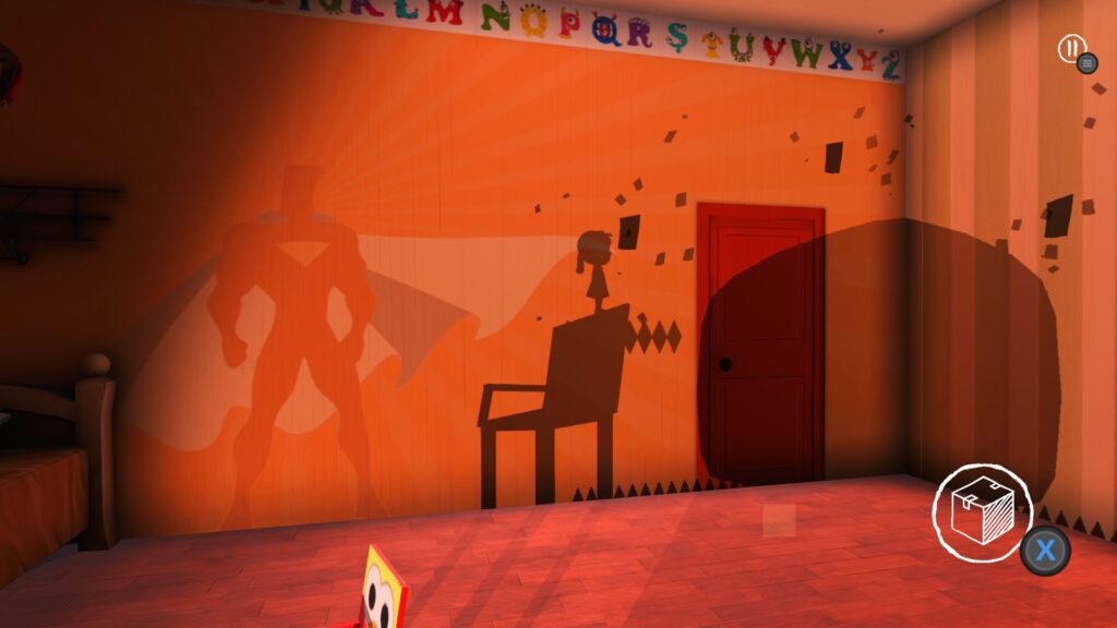
Other inconsistencies like how only some objects can be rotated but not others will get frustrating. Arranging objects takes up most of the time when playing and can make the experience feel more like a housekeeping sim than a platformer. This ultimately will make a lot of sense to anyone who plays In My Shadow, because the platforming mechanics are woeful.
The first thing noticed while doing our In My Shadow review is the extremely uncomfortable jumping controls. The protagonist can’t do much other than jumping and this simple action was completely botched. This little runt gets a decent enough vertical leap, but does not gain the right amount of distance. This feels especially wrong when doing a running jump since the inertia is lost while going airborne.
On top of these incoherent jumping mechanics, the player-character is very unresponsive. She goes from zero to 60 and is difficult to stop; making precision platforming way more difficult than it actually is. Inputs are also delayed and sometimes will require mashing a button to get anything to register.
The absolutely most annoying quirk of In My Shadow is the slow respawn time that has an overly drawn out fade. This is a game where retries should be instantaneous, with barriers or friction being as low as possible to ensure a smooth and fluid experience.
In My Shadow has instant death and puzzles are solved pretty quickly when the solution is figured out. Due to the sloppy controls, expect several unearned deaths and having to sit through a tedious slow respawn. As if it couldn’t get any worse; this low-spec indie game runs poorly on Xbox Series S.
Somehow, despite the visuals looking like something from a mobile game, the frame rate is very unstable. While arranging objects, the fluidity usually holds up better. When playing as a shadow, the framerate gets wild. In My Shadow has nothing that should tax a Wii and seeing this game struggle to maintain a steady frame rate is headache inducing.
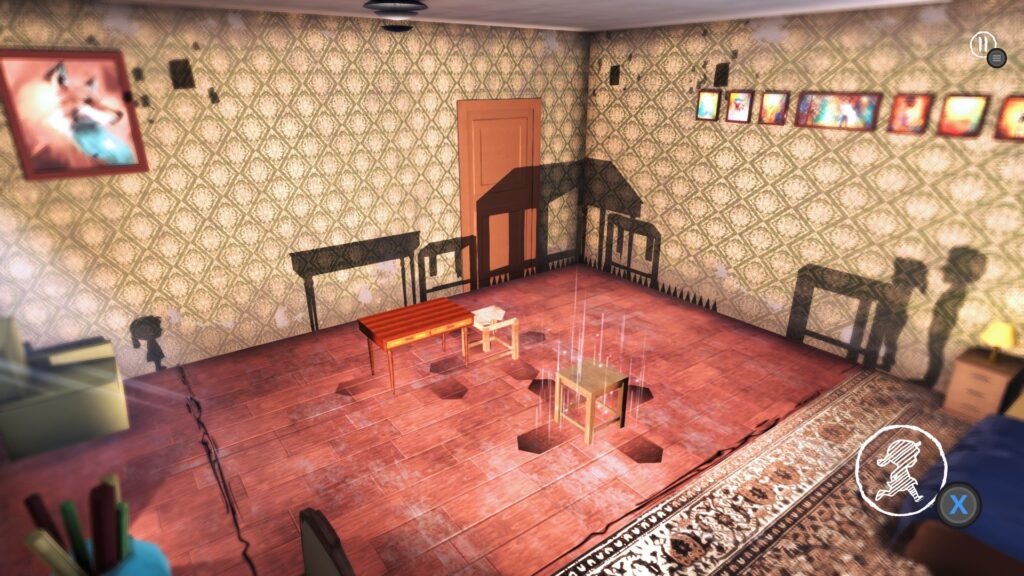
The art direction can be generously described as “lacking”. Most objects and textures lack any style and look like they were bought off the Unity 3D model store. In some instances, the seams of textures are visible- a tell tale sign of an amateur.
The house that the game is set in can’t decide if its a dollhouse or a real house. Not that it matters, since the rooms represented in-game resembles neither. Nothing feels real or genuine. If it is supposed to be a real home, there is no attention given to making the environment feel lived in or have any sense of style.
The scaling of objects or furniture compared to characters is also off and is inconsistent across the entire game. Some geometry is also layered incorrectly; like a carpet that runs under a fire place. The designer should have opted for something more minimalist to make up for the lack of resources.
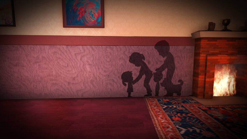
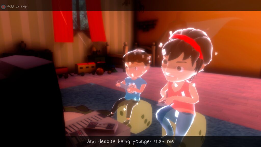
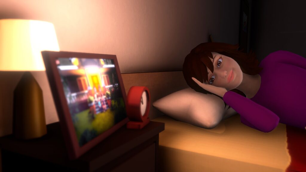
Character modeling and cutscenes are especially weak. At best scenes from In My Shadow resemble a very crude pre-visualization for scenes that were never made. Outside of a handful of instances that bookend the game, a majority of all scenes use unanimated character models in key pose instead of animating anything.
At this point, the developer may as well have used 2D art to convey the scenes. The models are not expressive enough to convey what is happening and this is supposed to be an emotional story about an ungrateful woman who feels regret for being a selfish daughter.
The narrative relies on the on screen text to get its point across. These inner monologues of a brat don’t help make the character look sympathetic. She just comes off more as a loathsome punk that needed a slap in the face. The whole story is this woman reflecting on how she was a dumb kid and can’t get over it, while ghosting her parents. The pay-off is as satisfying as the gameplay.
The developer understandably had limited resources when creating In My Shadow. Their ambitions were too great for what they were able to realistically achieve. They probably should have leaned in more on the 2D gameplay angle instead of the tedious object placement module of the experience.
Telling a story was very clearly one of the developer’s primary goals for In My Shadow. This is emphasized by the fact that the start screen allows players to skip the level entirely and with no consequences at all. Disinterested players can skip straight to the cutscenes if they can’t be bothered to endure In My Shadow.
When doing our In My Shadow review, we found it’s the kind of indie game that is so poor it becomes interesting. The layers of incompetence compound on themselves to make something worth talking about and is dense with examples of what not to do when making a game. At times, it’s comical that something like In My Shadow can exist and cost more than some original Xbox games in the Xbox Store.
In My Shadow was reviewed on Xbox Series S using a copy provided by Overgamez. You can find additional information about Niche Gamer’s review/ethics policy here. In My Shadow is now available for Windows PC (via Steam), Xbox One, Nintendo Switch, and iOS.