Publisher Electronic Arts and developer Petroglyph Games have given us another look at their upcoming Command & Conquer remaster.
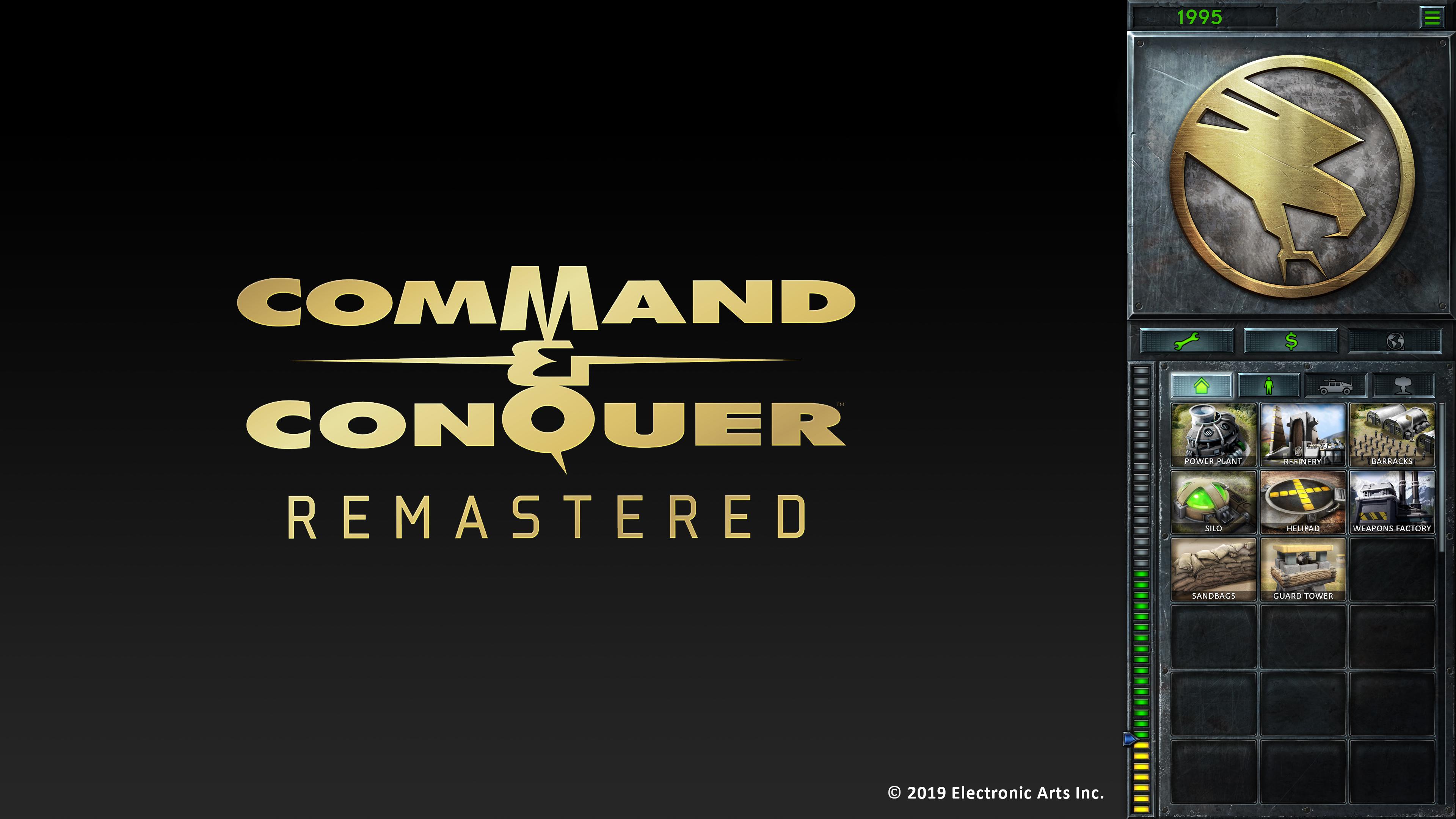
The developer has shown off the redesigned user interface for the first time, including the sidebar you’ll use to manage your building construction. You can get a look at that above.
The new sidebar is tailored to help reduce players scrolling, complete with bigger tabs to help divide out your buildings, vehicles, troops, and support abilities. If you’re a longtime fan, you’ll probably notice this is based on the menus from Command & Conquer 3.
The various repair, sell, and map buttons are all now presented as icons and not text, which further helps in localizing the game for other languages. The options button and the money display button are now in the sidebar instead of floating over the main display view.
Lastly, Petroglyph Games have confirmed development on Command & Conquer: Remastered has entered full production.