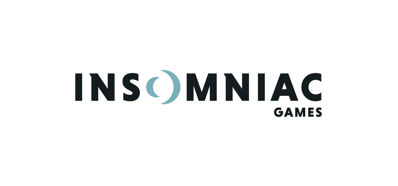
Insomniac Games has revealed a new company logo.
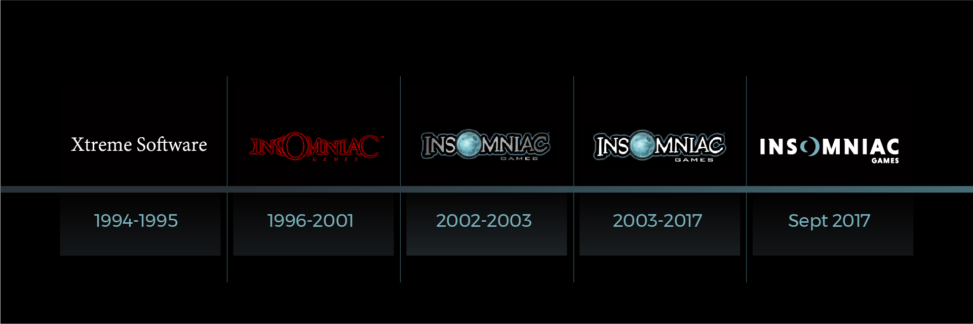
Featured above, you can get a look at the new logo design. The company’s previous logo, which retained their planet-design for the “O” letter, was the longest design they used – from 2003 to 2017. Their other logos were only used for a few years since they renamed the company from Xtreme Software to Insomniac Games back in 1996.
Here’s the full message regarding their updated logo:
We’ve always tried to evolve with the constantly changing industry we adore. That’s one of the challenges and blessings of remaining completely independent as a studio. But our logo has largely remained the same while we continue to grow. Considering our 25th anniversary in a couple years, and the 15th anniversary of Ratchet & Clank this year, it has become even clearer to us that it’s time to more closely match our visual identity with our studio vision.
As we contemplated a re-brand of our visual identity, we challenged ourselves to “think beyond the moon.” That meant eschewing a simple logo refresh. Instead, we wanted a redesign that reflected our evolution as a studio and as people while retaining some familiarity to our past logo treatments.
We’re very proud, excited, and yes, a little nervous to reveal our new Insomniac Games logo:
We reviewed this design very early in the exploration process. It caught our attention immediately, and wouldn’t let go even after we explored other directions. It works on multiple levels for us. It’s got a lunar theme, with what appear to be two crescent moons facing each other as the “O” – reminiscent of our past and future. Many folks here also see a portal or lens for the “O”, which we like because it symbolizes exploration as well as how many of our fans see us differently. Some follow us simply because we created their beloved Spyro the Dragon. For others, it’s all about Ratchet & Clank, or Resistance, Sunset Overdrive, our virtual reality games or Song of the Deep. And now we have entirely new fans swinging into our neighborhood to check out the latest on Marvel’s Spider-Man.
Observant fans will see the subtle callbacks to our previous Insomniac Games logo, including the oversized “O,” serif lettering on the “N” and the positioning of “Games” as a core part of our identity.
This is just the start of our re-branding effort though. You’ll see us become even more public-facing with our community, starting today with a livestream on our Twitch channel at 1:30 PST. And… we’re hiring! You can also see our new recruitment video here on the Careers page.
We hope you share our excitement for our new look – which really just reflects how we’ve been thinking about ourselves as a studio for a long time. Of course, we realize this shift may be jarring to some people. But to us, the brand redesign reflects a desire to evolve as a studio. And to be bold in doing so. We are mindful of our journey to this point, and especially grateful to our family of fans who have been there through good times and challenging moments too. We’re excited about the opportunity to continue designing our own future, and hope you’ll continue to join us for the crazy ride.
It’s worth mentioning that Insomniac Games are currently hiring various staff roles, including audio, art, creative, programming, and QA. Their latest game, Spider-Man, is coming to PlayStation 4 sometime next year.